Lenovo and Samsung have new Chromebooks you need to check out
Google invited me to New York to look at the newest Gemini AI tools going into Chromebooks. But I don’t want to talk about that, because it’s boring. Instead I want to talk about the new Chromebook models they showed me after: an updated version of Lenovo’s mega-popular Chromebook Duet, and a crazy-sleek design from Samsung on the Chromebook Plus platform.
The (New) Lenovo Chromebook DuetThe original Chromebook Duet was launched back in 2020, and it turned some heads. With a 10-inch tablet form factor plus a detachable keyboard and kickstand in the box, it was basically a perfect mix between Microsoft’s Surface form factor and an iPad’s ease of access. The fact that it started at under $300 didn’t hurt — Google told us this might be the best-selling Chromebook model ever. My colleague at the time called the Duet “The Basically Perfect Chrome OS Device.”
You can still find that tablet everywhere, especially after a mild refresh in 2022 (the Duet 3, sold alongside the bigger Duet 5) with a new processor and a second USB-C port. But this 2024 model, simply called the Duet again, is a rebuild from the ground up. It’s the same general form factor, but the whole thing is considerably more solid, reaching much closer to a Surface Go in terms of fit and finish than the older model.
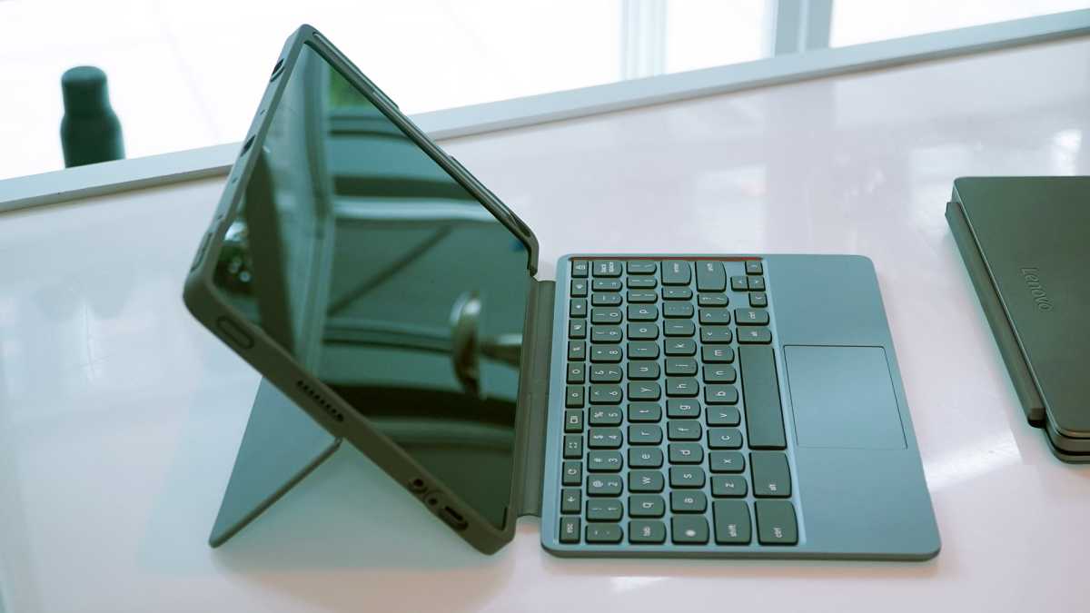
This variant model for the education market comes with an impact-resistant case fully surrounding the tablet.

This variant model for the education market comes with an impact-resistant case fully surrounding the tablet.
Michael Crider/Foundry

This variant model for the education market comes with an impact-resistant case fully surrounding the tablet.
Michael Crider/Foundry
Michael Crider/Foundry
I’d say it feels better than the Duet 5, though it’s lacking that 13-inch tablet’s OLED screen. The 1920×1200 display here feels a lot brighter than the original Duet, and the rounded corners make it feel a lot newer, especially when holding it like a standard tablet. That 16:10 aspect ratio makes it a lot more natural for use with Android apps, too.
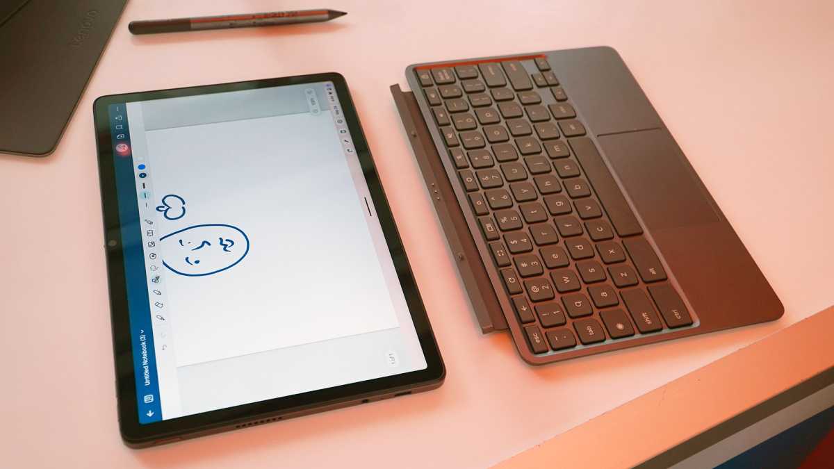
The standard “desktop-style” experience is improved thanks to a better keyboard. It’s thicker and heavier, making it feel much more solid and natural for a mechanical keyboard nut like me, more akin to Lenovo’s ThinkPads than the original. The plastic touchpad is about the same, which is to say pretty bad, but you make sacrifices for a budget machine.
Considering that this is a budget machine (it starts at $340 with the pen included), I’m happy to see a couple of very deliberate upgrades over the original design. The secondary USB-C port is a bit awkward, sticking out of the top of the machine instead of the side — I’m guessing this was done to make more contiguous space inside for the battery. But you can plug in a USB-C flash drive without unplugging from a monitor or charging cable, so it’s a definite usability upgrade. On the same note, there’s a headphone jack, something that was inexplicably missing from the original Duet, and shouldn’t be from anything that’s aiming for a budget market.

Michael Crider/Foundry

Michael Crider/Foundry
Michael Crider/Foundry
Like almost everything Lenovo makes as of late, there’s a physical shutter to cover the front-facing webcam. I bet that’ll make some parents happy, as Google tells us that these models are sold in bulk to a lot of education customers. Lenovo is making an education version, as a matter of fact, with a much more durable and impact-resistant case that completely surrounds the tablet (above, and not available at standard retailers, from what I was told). The tablet is compatible with any USI 2.0 stylus, and it comes with new “99.7 percent effective” palm rejection tech in the screen.
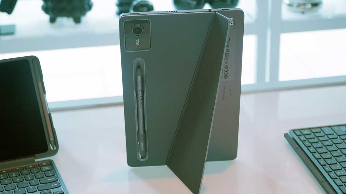
The new Duet has a slanted kickstand that works in portrait mode, but offers fewer positions in landscape.

The new Duet has a slanted kickstand that works in portrait mode, but offers fewer positions in landscape.
Michael Crider/Foundry

The new Duet has a slanted kickstand that works in portrait mode, but offers fewer positions in landscape.
Michael Crider/Foundry
Michael Crider/Foundry
After using the Duet for a few hours, I’m not thrilled with the updated rear kickstand cover. The jaunty angle of the hinge lets it work in either landscape or portrait mode, which is nice…but it also means that it only works with one, count ’em, one angle. That could make the Duet far less flexible for anyone who wants to use it as a laptop in tight spaces.
I’m just fine with a low-price machine coming with low specs (a MediaTek Komanio 838 Arm processor, 8MP rear camera, et cetera), but the base model comes with just 64GB of storage and 4GB of RAM. Low storage, fine, that’s expected on a Chromebook, even though this one might benefit from a lot more space for Android apps. But I suspect this thing might start to chug on so little memory, especially considering how much of a hog Chrome (and to be fair, most modern websites) is.
And sadly the review unit they lent me has that 8GB/128GB setup, which will run $390 at retail, so I won’t be able to check how it performs on the model most budget-conscious buyers will be drawn to. I’ll be giving this one a full review on PCWorld, but it should go up for pre-order sometime later this month.
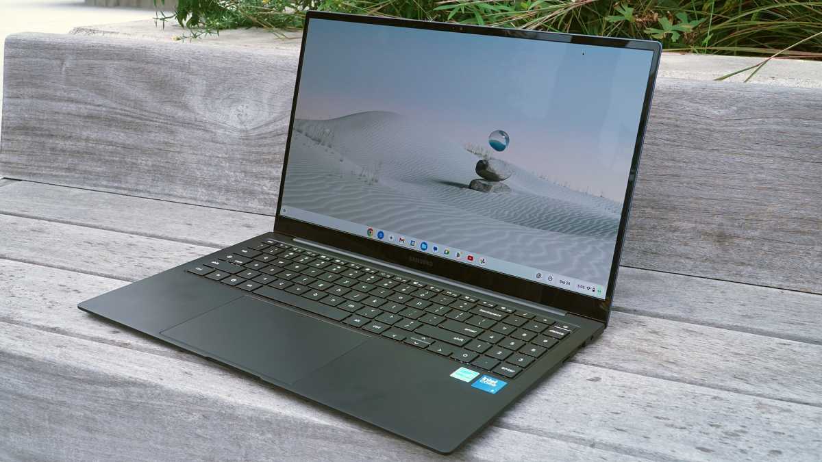
Samsung Galaxy Chromebook PlusIf you want a more conventional laptop and/or your budget will stretch a little higher, you’ve got to check out Samsung’s first entry in the Chromebook Plus arena. This thing is shockingly thin and light, reminding me a lot of LG’s Gram series. Google told us it’s the thinnest and lightest Chromebook available that meets those Chromebook Plus (and extra AI) requirements.

Michael Crider/Foundry

Michael Crider/Foundry
Michael Crider/Foundry
But even though it’s just 2.58 pounds and 0.46-inches thick, it’s packing some impressive hardware. The most obvious thing is that 15.6-inch OLED screen, the kind of panel you don’t often see on a Chromebook of any size (at least since Google stopped making its own Pixel laptops). The all-aluminum chassis is smooth and feels great, though I have to admit I miss the fire-engine red of Samsung’s earlier premium Chromebook designs.
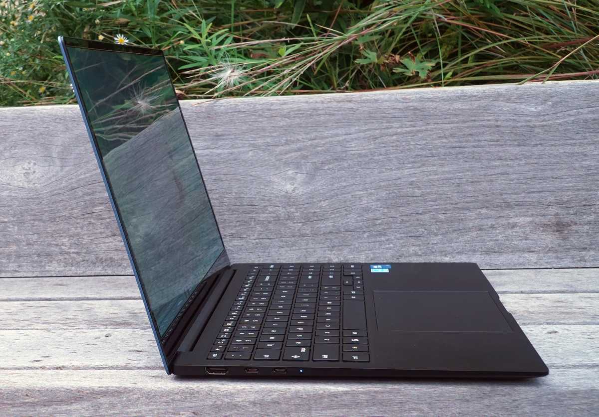
This thing is so thin the HDMI port sticks out of the bottom of the case.

This thing is so thin the HDMI port sticks out of the bottom of the case.
Michael Crider/Foundry

This thing is so thin the HDMI port sticks out of the bottom of the case.
Michael Crider/Foundry
Michael Crider/Foundry
I’m impressed that even with something so thin and light, Samsung squeezed in two USB-C ports, full-sized USB-A, and a full HDMI port — taking up so much of the Z-height that it’s actually sticking out of the case at the bottom. (Don’t drop it at the wrong angle.) With a Core i3 processor, 8GB of RAM, and 256GB of storage, the specs are pretty mid…but that $699.99 price tag is shockingly low for a Samsung laptop with an OLED screen. You’ll find cheaper Chromebooks out there, and maybe even cheaper ones that qualify for the Chromebook Plus designation. But they won’t be anywhere near this nice.

Michael Crider/Foundry

Michael Crider/Foundry
Michael Crider/Foundry
The one thing I’m wondering about is the battery life, something Samsung struggled to deliver on earlier high-end Chromebook models. But we’ll let the review sort that out — Ashley Biancuzzo should have that one for you.
New interface tweaksAs you might have spotted on the Galaxy Chromebook Plus above (but not the Duet, tellingly), the Chromebook keyboard is looking a little…different. Since the launch of the platform Google has replaced Caps Lock with a dedicated Search button and omitted an omni key (the Windows button on most keyboards). Now Caps Lock is back, sort of, and there’s a dedicated Google “G” where you might expect a Windows button on most laptops.
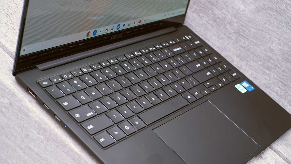
New Chromebooks will get some keyboard layout tweaks.

New Chromebooks will get some keyboard layout tweaks.
Michael Crider/Foundry

New Chromebooks will get some keyboard layout tweaks.
Michael Crider/Foundry
Michael Crider/Foundry
Here’s what’s changing. The “G” button is what Google is calling the Launcher key, which will bring up the Windows-style menu that has all the most recent apps and automatically begins the search with any letter or number. That’s pretty standard. The Caps Lock key is not Caps Lock by default (though you can change that just like you could before), now it will be “Quick Insert.” It’s a hard-coded shortcut to Gemini tools.
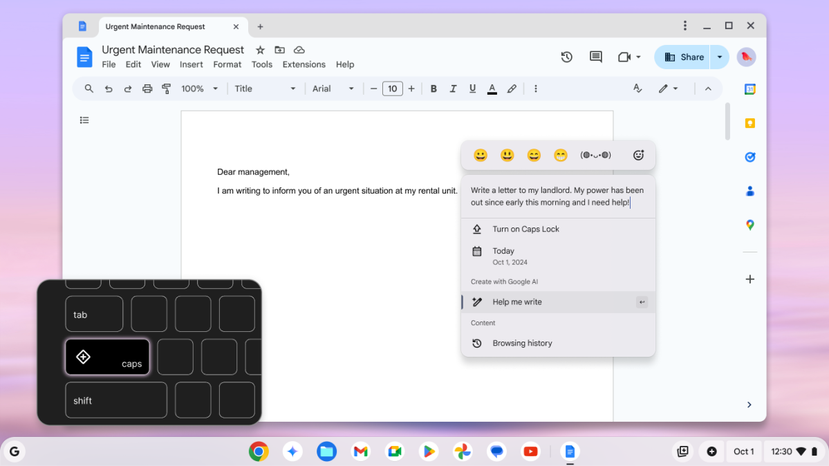


The F11 key is also an accessibility shortcut — it’ll default to a voice dictation tool. For all existing Chromebooks, or new ones that don’t have the updated layout, you can launch the Quick Insert tool by using Search/Launcher + F. And at this point I guess I can’t put off talking about AI stuff any longer.
New Gemini toolsGoogle’s presentation focused on the way its Gemini AI tool is improving users’ access to both information on the web and their own info, synced through using Chromebooks, Chrome on desktops, and Android-powered phones. Presumably you’ll get more access to this if you have a phone that integrates with Gemini like a Pixel, but using Google services on your iPhone should be able to hook into it, too.
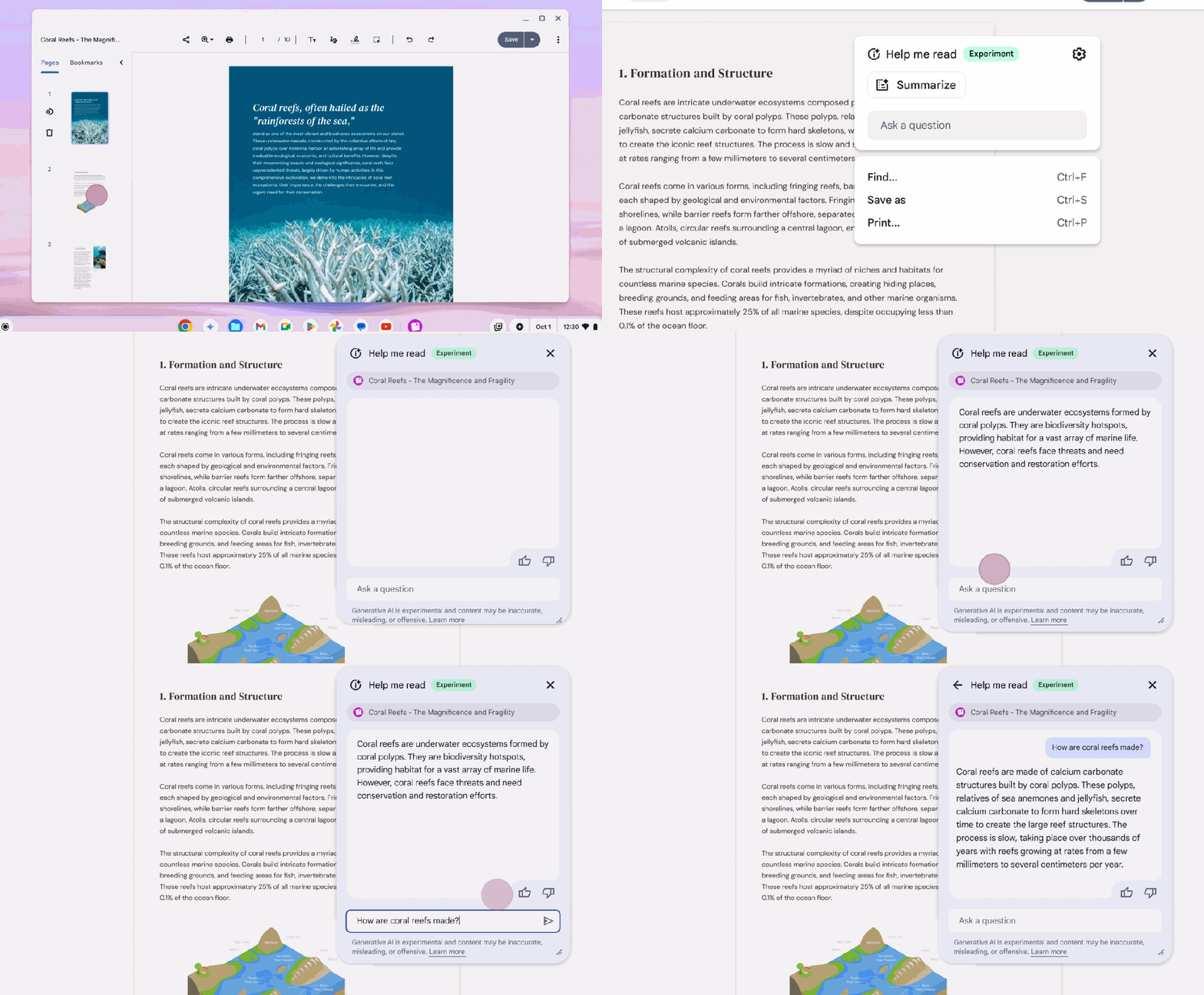


The big draw according to Google’s video is that you can “do less so you can do more.” This is typified with large language text expansion and contraction tools; we’ve seen “Help Me Write” before, now there’s a companion service called “Help Me Read.” This can summarize any web page or document on your Chromebook (even those open in, say, the Office 365 Word app) and give you the tl;dr on its contents.
Perhaps more helpful is that it can answer natural language questions. Say you’re studying Moby Dick, you could ask for all the times that Queequeg talks to Ishmael about his homeland. That’s just an example, by the way — I didn’t get a chance to try out something that would tax Gemini quite so hard.
Star Wars-style translation toolsBut it’s more than LLM tricks with text. Something that really impressed me was the way Chromebook Plus demos could do live language translations. One speaker in front of us was talking to a coworker in another room. The man in the room with us spoke English, the woman in the other room spoke Spanish. Her speech showed up immediately on the live video in English subtitles. It wasn’t perfect, even with my high school level of Spanish language comprehension I spotted a couple of errors. But it was fast and natural enough that you could carry out a real conversation in real time, no need to wait for the tools to catch up with you.
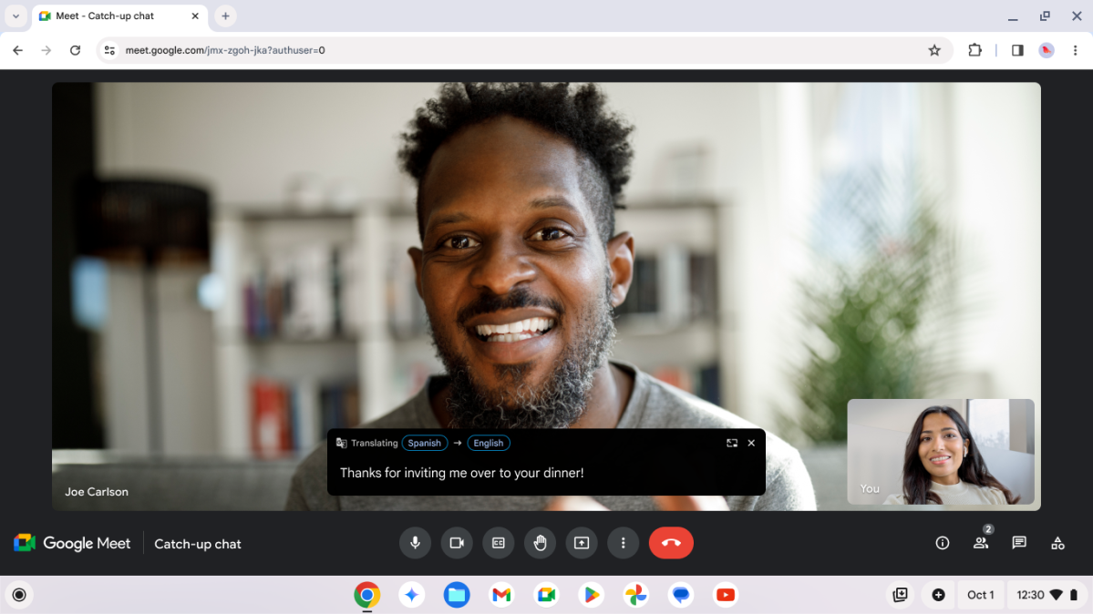


It reminded me of how Han spoke to Greedo in Star Wars, both speaking their own language, both understanding each other instantly. Is that too dated a reference? Anyway, this capability will also work across services, so it’s ready to go for Zoom, Teams, and whatever Google is calling its video chat platform this year. Google also says it’s using on-device AI to improve video and audio.
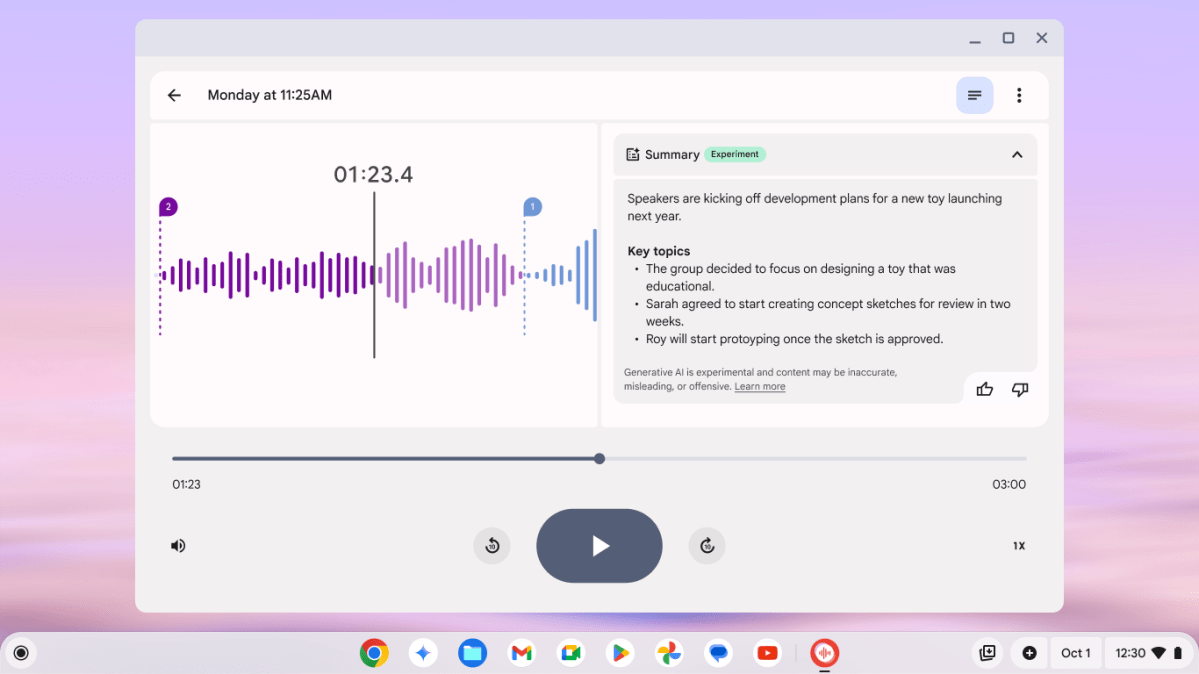


Another very cool trick: The recording app could not only give you a text transcript of a recording session, but identify different speakers. The live recording showed these differentiated people as “Speaker 1,” “Speaker 2,” et cetera, but you can go back and assign names to the speakers manually and it’ll fill in the rest of the document. I could see that being extremely handy for students and anyone who needs to transcribe an interview.
Welcome Recap remembers everything you’re doingThe other impressive tool on offer was the Welcome Recap. This is kind of a more refined version of your browser remembering your last-used tabs and bringing them back when you reboot your computer. But Chromebook Plus extends this idea to, well, pretty much everything you’re doing, on every device. (With the obvious limit that Google has to “see” what you’re doing, of course.)
Upon starting up or logging into your Chromebook, it’ll give you an option to initiate Welcome Recap, which will not only open your relevant Chrome tabs, but any apps that you were using too. Yes, most Chromebook apps are essentially just web apps, but this should work with Android apps as well, according to the demo we were given. What’s more, it’ll work across the spaces where you engage with Google services: Chromebook to Chromebook, Chrome on Windows or Mac, Android apps on your phone, presumably even Chrome on iPhones and iPads. If you’re doing it in Chrome, your Chromebook will remember, and let you resume. Welcome Recap will work on all Chromebooks, not just Chromebook Plus models, though sadly it doesn’t seem to be live on my Duet review unit.
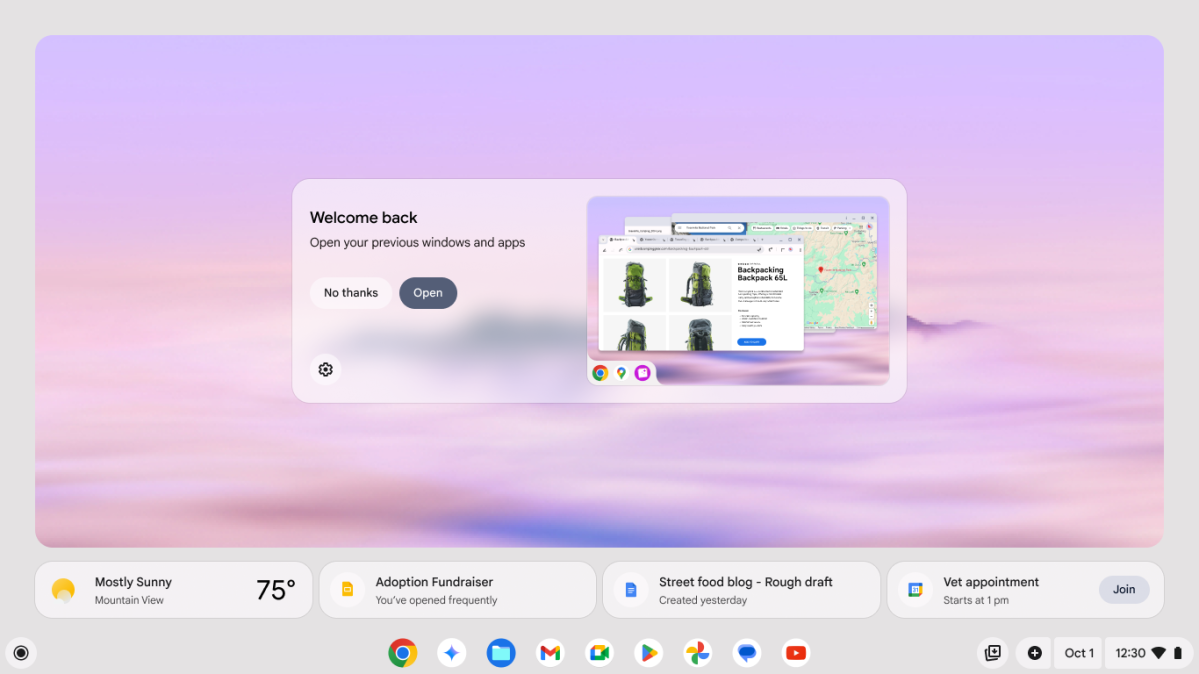


This recovery system works even if you happen to have multiple monitors connected — Welcome Recap will put them right back where they were. It’ll offer up quick links to your most recent web searches. It was impressive as hell to watch, especially when the demo laptop (one of the Galaxy Chromebook Plus units at the event) crashed right in the middle of the demo. That isn’t really unusual for a pre-release demonstration like this, but what happened next was.
The unflappable presenter just pressed the power button and kept on with her impromptu script, and the laptop (and its attached display) were back in action after about 25 seconds. Welcome Recap worked exactly as it was intended. Assuming those of us watching hadn’t been easy marks — and I seriously doubt it — it was a serendipitous example of how useful Welcome Recap might be for regular users.
That seems to encapsulate Google’s approach to Gemini AI as a whole. Google knows Chromebooks are swinging for a budget- and education-focused space that Windows and Mac laptops sometimes overlook, so the company is trying to make a case for Gemini as the AI that’s useful for everyone, in every situation.
Gemini and Google One freebiesTo wit, they’ve included an impressive one year of Google One Premium at the 2TB tier with any Chromebook Plus purchase. That also includes a year of Gemini advanced AI tools. If you buy a regular, non-Plus Chromebook, you get three months instead. Those perks also include YouTube Premium and YouTube Music, three months of access to Photoshop, and the Minecraft Realms game, and a few other goodies. Keep in mind that once your freebies run out, the 2TB + Gemini Advanced tier will run you $20 a month.
