Designing User-Centric dApps: 5 Best Practices for Web3 UX

Users struggle with poor Web3 dApp UX. This leads to frustration and lower Web3 adoption rates. This is why Web3 projects look for methods to improve their dApp UX to increase user engagement and retention. We want to explain how to reduce friction for new users, discover strategies for creating clear user flows that enhance user experience, and find out how to implement robust security features without compromising usability.
According to DappRadar’s Q2 2024 report, the dApp industry saw a 40% increase in usage compared to the previous quarter, reaching 10 million unique active wallets daily. However, many users find Web3 UX design complicated, insecure, and difficult to navigate. By understanding the specific needs of different user personas, you can adjust your dApp UX to provide a more user-friendly experience.
Why do we write about user-centric design for Web3 platforms? Our team closely works with Web3 startups, helping them to develop dApps with user-centric UX. For example, we have worked on Fairspin, an online casino for crypto enthusiasts.
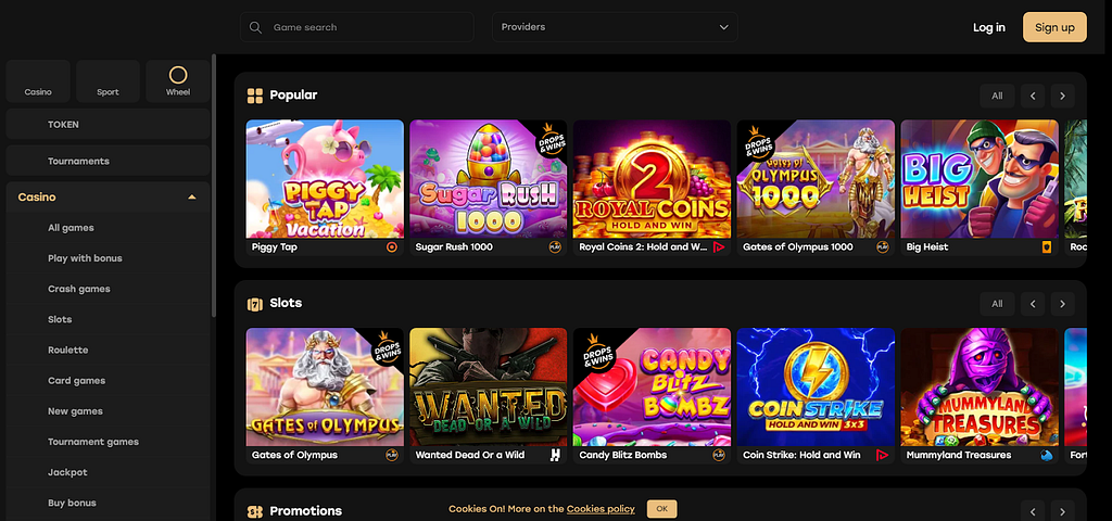 ALT: dAрр developed by Dexola
Our article will cover how to design UX for Web3 applications along with 5 best practices for designing user-centric dApps.
Understanding User Needs and Challenges in Web3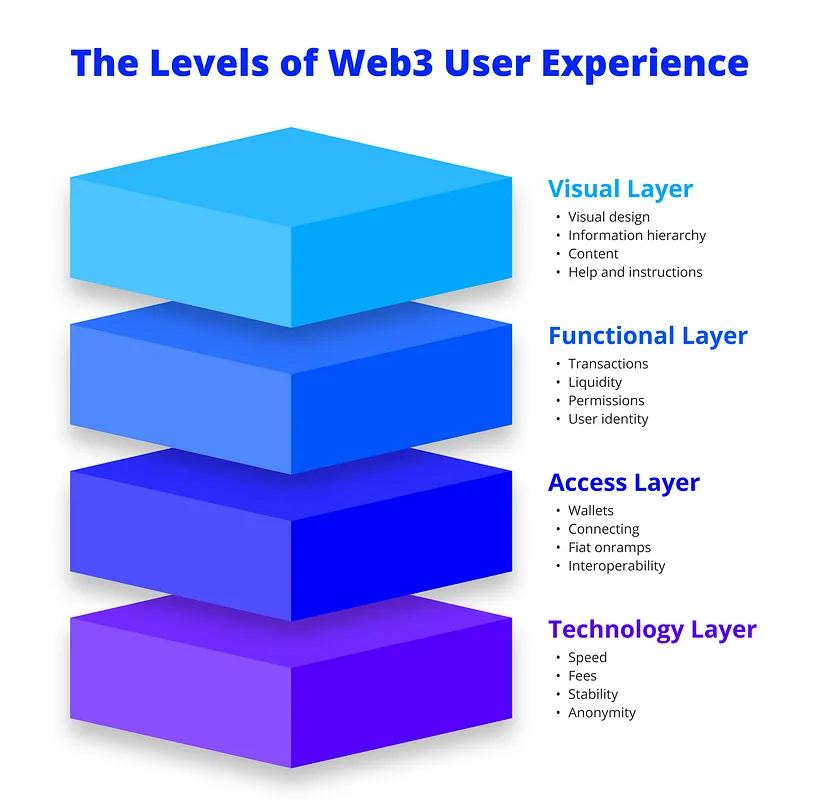 Source — ALT: 4 levels of Web3 UX
It is important to understand how users interact with complex technologies like blockchain and smart contracts. This knowledge helps simplify intricate processes, address security and trust concerns, and lower adoption barriers by making interfaces more intuitive and user-friendly.
User Needs in Web3 UX for Decentralized AppsBlockchain technology can be confusing, and users need interfaces that make these complex processes straightforward. If a Web3 product is too complicated or hard to navigate, users will quickly abandon it. A well-thought-out UX that clearly shows security measures and provides transparent processes helps build trust, which is crucial when financial transactions and personal data are at stake.
Moreover, focusing on user needs boosts accessibility and engagement. Many users are new to Web3, and a user-friendly Web3 dApp design can make these technologies approachable. Simplifying technical language and offering clear guidance make a big difference. When an app is easy to use and understand, people are more likely to stick with it and recommend it to others. This not only improves user satisfaction but also promotes the broader adoption of decentralized apps.
Bellow, we have created a table with 3 user personas and their needs. It will help you understand what each user type will appreciate in your Web3 dApp UX.
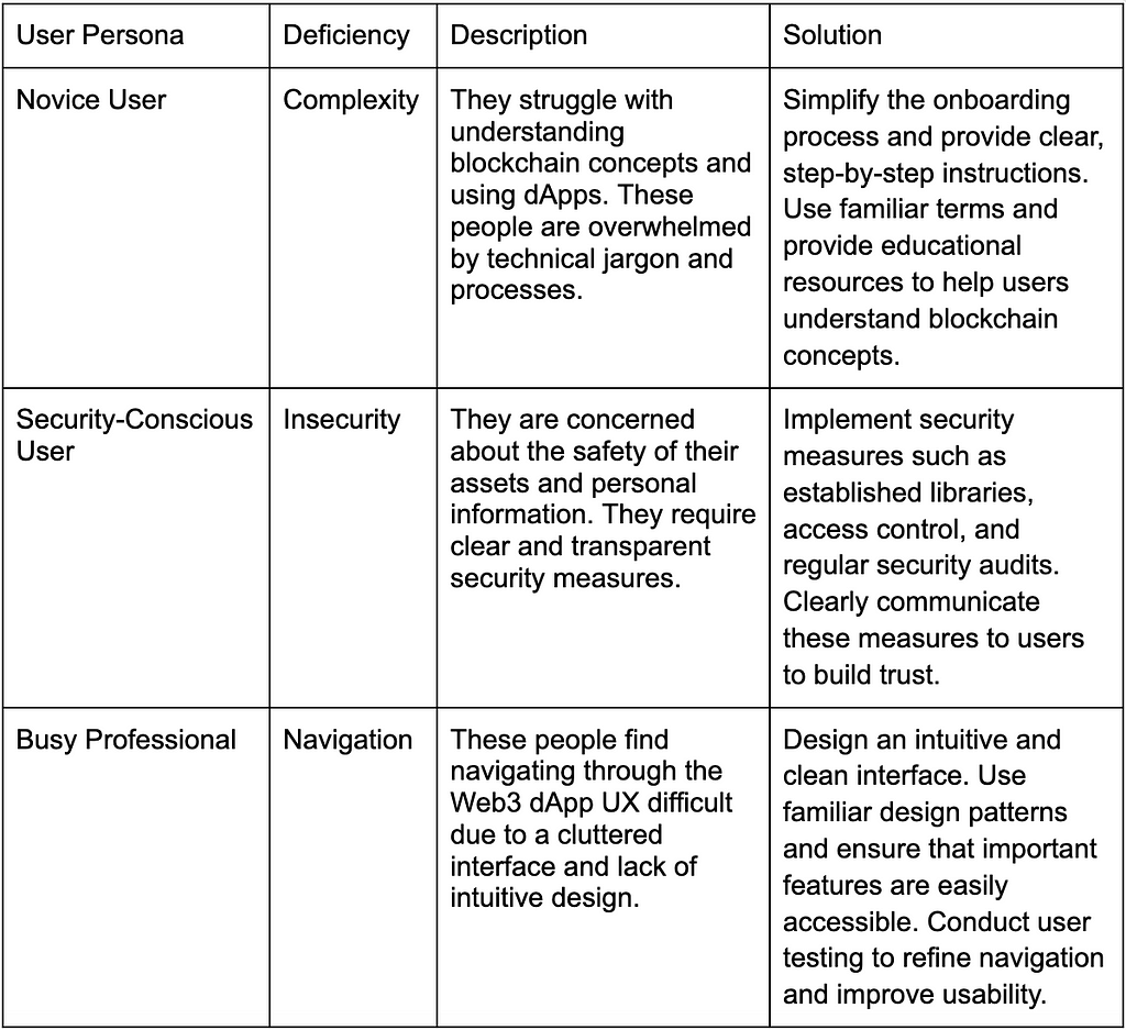 Challenges in Web3 UX for Decentralized Apps
Unlike traditional applications, dApps need to cater to both tech-savvy users and those new to the decentralized world. Here are the primary UX design challenges in Web3 designers must address:
- Complexity of blockchain technology. Blockchain is inherently complex. Designers need to simplify this complexity without losing functionality. Users should understand what’s happening behind the scenes, but not be overwhelmed by it. Clear, concise interfaces and helpful tooltips can bridge this gap.
- Security and trust. Security is paramount in Web3. Users need to trust the dApp with their funds and data. Designers must create interfaces that convey security through transparent processes. For example, clear transaction summaries and confirmations can reassure users that their actions are safe and intentional.
- Wallet integration. Integrating wallets smoothly is critical. Users often need to connect their digital wallets to interact with dApps. This process should be seamless, with clear instructions and feedback. Ensuring compatibility with multiple wallet providers adds an extra layer of complexity but is necessary for accessibility.
- Transaction feedback. Blockchain transactions aren’t instant. Designers need to manage user expectations around transaction times. Real-time feedback, such as progress indicators or status updates, helps users understand that their transactions are processing. This reduces anxiety and improves the overall user experience.
- Onboarding new users. Many users are unfamiliar with decentralized systems. Onboarding processes should educate without patronizing. Simple guides, intuitive navigation, and contextual help can ease users into the dApp experience, making the learning curve less steep.
So, how to create awesome Web3 UI/UX overcomming dApp challenges and utilizing user needs to your advantge? Here are the 5 best practices for Web3 UX design from our Dexola team.
Best Practice #1 — Simplifying Onboarding and RegistrationComplex and lengthy onboarding processes drive users away. You must create a seamless and user-friendly registration flow to ensure a positive first impression and a higher likelihood of engagement with your dApp. Here are some key tips to improve your Web3 UI/UX:
- Use progressive disclosure. Avoid overwhelming users with too much information upfront. Progressive disclosure presents information gradually. As a result, this helps users understand each step without feeling bombarded.
- Simplify wallet integration. Integrate popular wallets and ensure the process is straightforward. Users should be able to connect their wallets with minimal effort.
- Provide clear instructions. Ensure that instructions are concise and clear. Use tooltips, pop-ups, and brief tutorials to help users understand complex concepts. These tips will significantly enhance UX design for Web3 projects.
- Minimize required information. Ask for only essential information during registration. Long forms can be off-putting and lead to higher abandonment rates.
Users often need help managing and understanding their transactions. Implementing Web3 UX trends that simplify transaction management is essential to improving and fostering trust. Here are our top tips to improve UX for Web3 dApps through transaction management:
- Make users’ transaction histories easily accessible. Users should be able to view their transaction histories without hassle. An accessible and well-organized transaction history helps users keep track of their activities and quickly identify any discrepancies.
- Implement a “Send Max” button. A “Send Max” button lets users quickly transfer the maximum allowable amount from their wallet without manual calculations. This feature simplifies the process and reduces errors, enhancing user experience in Web3.
- Communicate exchange rates using familiar currencies. Display exchange rates in familiar fiat currencies to help users understand the value of their transactions. This practice reduces confusion and enhances user confidence.
Most users have significant concerns about the security and trustworthiness of dApps. This reflects negatively on the whole Web3 UX industry.
In Q2 2024, the industry saw losses of $430 million due to security breaches, reflecting a 5% increase since the last quarter. This is why implementing strong security measures is paramount. You must also clearly communicate them to the user. This will increase trust and create a positive experience.
Here are the Web3 UX solutions our Dexola team recommends you to employ:
- Use established libraries and frameworks. Employ well-established libraries and frameworks to guarantee your dApp is built on secure and tested foundations. This reduces the risk of vulnerabilities and increases user confidence in the app’s security. When developing dApps, we at Dexola use established libraries like OpenZeppelin for smart contract development. Such libraries have undergone extensive security audits. Thus, we can ensure the integrity and security of our smart contracts.
- Implement access control. Proper access control mechanisms must protect sensitive operations and data. This includes role-based access control (RBAC) to restrict access based on user roles. We implemented RBAC in our dApps to limit access to administrative functions and sensitive data. This minimizes the risk of unauthorized actions and data breaches.
- Practice exception management. Handle exceptions gracefully to prevent potential security vulnerabilities. Proper exception management ensures that errors do not expose sensitive information or disrupt the user experience. Our team follows strict exception management protocols, guaranteeing that any errors are logged and handled without exposing sensitive details to the user. This practice helps maintain a secure and stable environment.
Slow and unresponsive dApps frustrate users and often lead to abandonment. Your dApp must perform efficiently and scale to accommodate increasing user loads. Here are some techniques for optimizing dApp performance and therefore influencing Web3 user experience design.
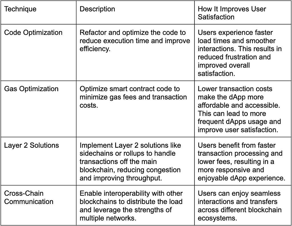
We have an awesome Web3 UX case study. For the Nimbus Platform, we implemented cross-chain token wrapping. It allowed our client to satisfy users’ needs thanks to more sophisticated functionality and transactions at a lower cost.
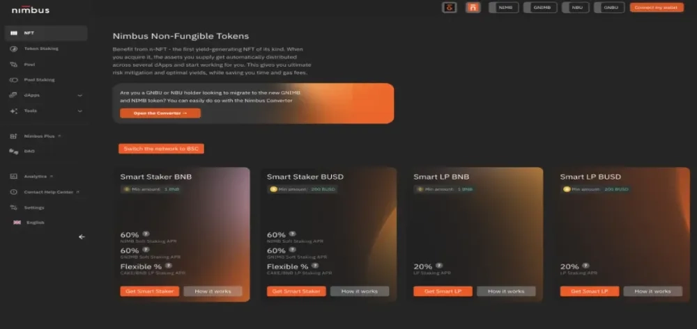 ALT: Nimbus Platform UI/UX developed by Dexola
Best Practice #5 — Incorporating Feedback and Iteration
To create a user-centered design for your Web3 dApp, you must continually incorporate user feedback and iterate on your features. Users often have valuable insights that can help you improve the Web3 design usability and functionality. Here is what we recommend to you:
- Establish continuous feedback loops. Create channels for users to provide feedback easily, such as in-app surveys, feedback forms, or community forums. Regularly review and act on this feedback to make necessary improvements. For example, many of our clients have in-app feedback systems where customers can rate their experience and suggest improvements.
- Conduct regular user testing. Regularly conduct user testing sessions to observe how real users interact with your dApp. This helps identify usability issues that may not be apparent during development.
- Implement agile development practices. Use agile development methodologies to iterate quickly based on user feedback. This allows you to make incremental improvements and adapt Web3 interface design to changing user needs. Our Dexola team follows agile practices, including bi-weekly sprints and regular retrospectives. This approach enables us to quickly address user feedback and continuously enhance our dApp.
Dexola is an autonomous blockchain software development branch of Trinetix, a globally trusted digital partner serving enterprise clients. We at Dexola focus on startups and help them build their blockchains and ecosystem applications by providing the same level of consulting and delivery services that enterprise clients are used to. We comprise:
- 30+ developers
- 40+ completed projects
- 5 years of excellence
- 800+ development and design professionals in Trinetix
If you are looking for a reliable DeFi development partner, we are here to help you. The nature of Dexola as a separate company and brand allows for an agile approach, proper mindset, and culture that aligns with small and medium businesses. With a diverse dApp tech stack, our team handles any kind of product.
 ALT: Fairspin
We worked on Fairspin — an online casino with the possibility to bet in crypto. In 2 months, the Dexola team built a custodial wallet for this online casino. We constructed it user-friendly with auto-created wallets during the signup. We also provided an admin-side monitoring tool. We helped Fairspin offer more payment choices and improved UX.
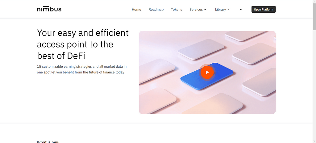 ALT: Nimbus Platform
Dexola team also worked on Nimbus Platform — platform that combines multiple financial instruments. We developed smart contracts, backend and frontend solutions, and performed full product testing. With our help, Nimbus Platform became an advanced DeFi platform that beats many big competitors in functionality and leads the Web3 UI/UX area among DeFi products.
ConclusionSo, we explored 5 best Web3 UX design strategies:
- Simplifying onboarding and registration.
- Enhancing transaction management.
- Ensuring security and trust.
- Optimizing performance and scalability.
- Incorporating feedback and iteration.
Each of these practices addresses common user pain points, improving engagement and retention. As Web3 and dApps evolve, the future of UX in Web3 projects will focus increasingly on building seamless, intuitive, and secure experiences that compete with traditional web applications. Consistent and reliable user experiences will drive broader adoption and satisfaction.
For more insights on how to apply these best practices to your dApp, feel free to contact our team. We are here to help you learn and adapt these techniques to create a user-centric and successful dApp.
Designing User-Centric dApps: 5 Best Practices for Web3 UX was originally published in Coinmonks on Medium, where people are continuing the conversation by highlighting and responding to this story.
